
AI Is Redefining Scientific Visualization
For a long time, creating scientific figures has been an exhausting and time-consuming process. Many researchers have experienced the same workflow: repeatedly adjusting arrows in PowerPoint just to finish a flowchart, endlessly tweaking fonts and colors in Illustrator to maintain consistency, or reorganizing entire layouts simply to make a figure more readable. The real difficulty has never been ‘not knowing how to design,’ but rather the fact that scientific figures demand accurate information, clear structure, consistent styling, and professional visual presentation at the same time — and existing tools require enormous manual effort to get every detail right.
As a result, figure production has long been one of the most disproportionately costly steps in research communication: the time and energy it consumes often far exceed what the work itself should require. This is especially true for social science research in and on the Global South, where mapping commodity chains, capital flows, networks of power, or histories of struggle depends on visual communication that text alone cannot convey — yet access to professional design infrastructure has historically been out of reach. The emergence of AI has fundamentally changed this situation for the first time. Modern image-generation models are now capable of understanding module hierarchies, page layouts, workflow structures, scientific illustration styles, and even complex chart compositions. Even the long-standing issue of garbled text has improved significantly. This means researchers can finally spend less time manually arranging layouts and more time focusing on communicating ideas.
Scientific Figures Are Not All the Same
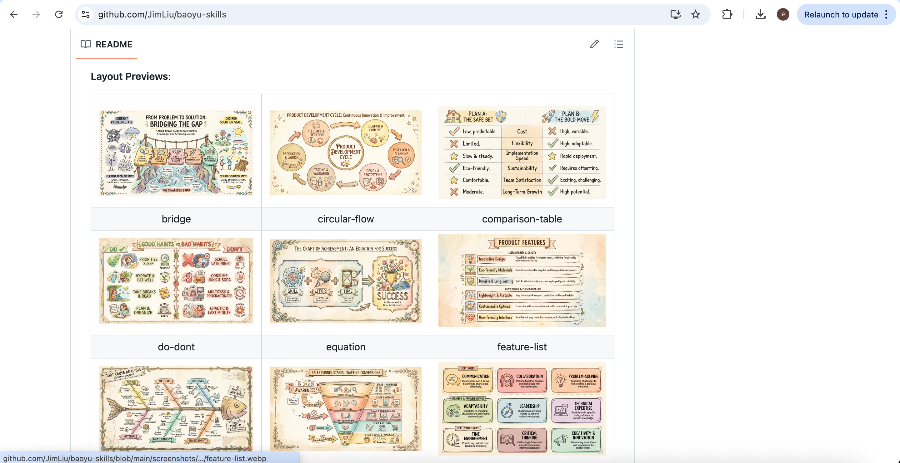
When many people first try AI image generation, they simply type something like ‘help me draw a scientific figure.’ In reality, however, scientific figures come in many different forms, and each type requires a completely different visual structure. The examples in this section are AI-generated figures based on Tricontinental’s dossier War on the Poor: A Frontline Report on the Effects of the Pandemic in the Global South, illustrating how each figure type can communicate different aspects of movement research.
Scientific Infographics
Scientific infographics function more like visual summaries. Their goal is not to present every technical detail exhaustively, but to help readers quickly grasp the research context, the problem being addressed, the core argument, and the key findings within seconds. Because of this, infographics often combine icons, modular layouts, concise text, color segmentation, and highlighted regions to establish clear visual hierarchy.
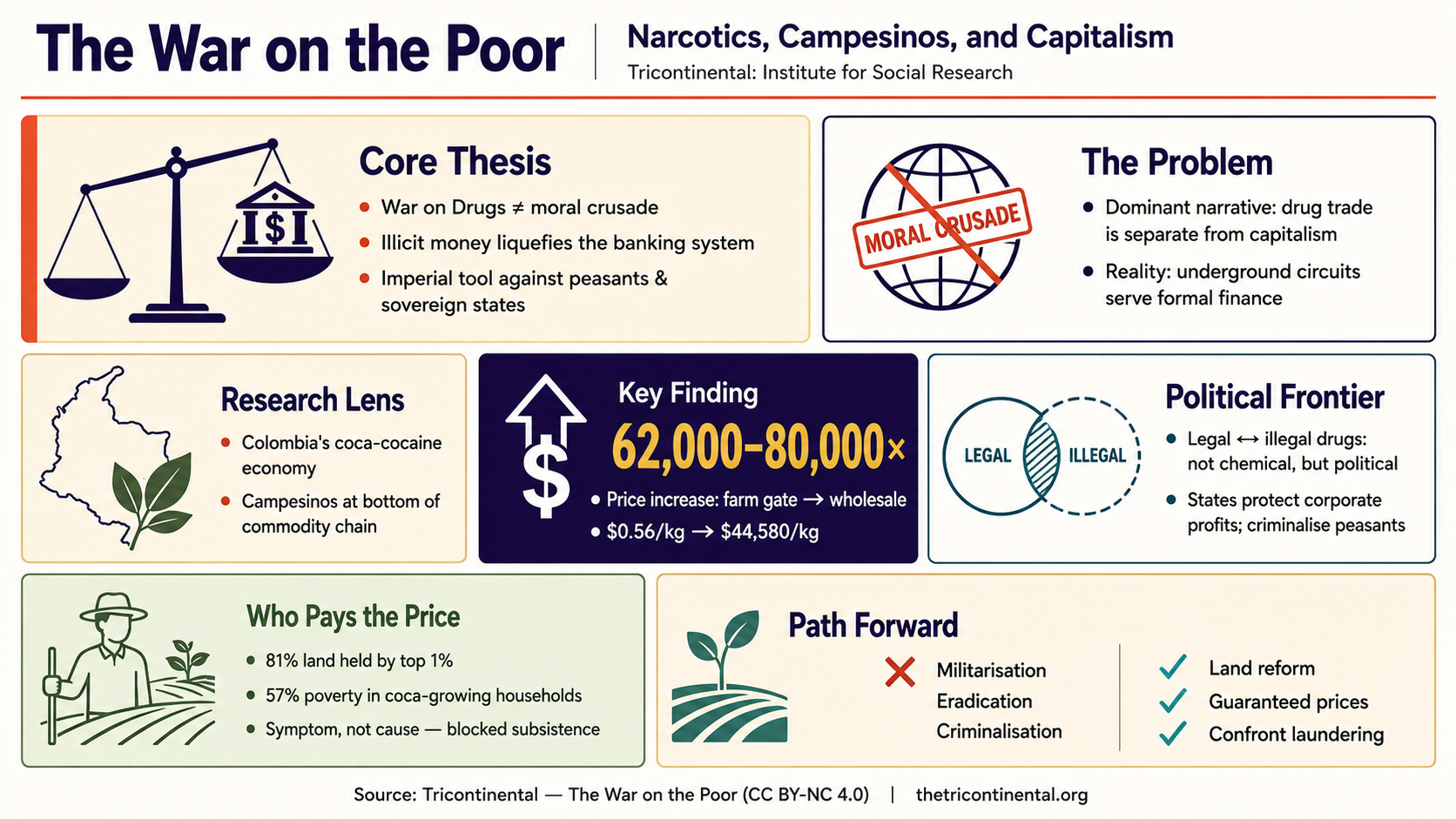
AI-generated infographic based on Tricontinental’s dossier War on the Poor.
Compared with traditional paper figures, infographics place much greater emphasis on readability and viewing experience. They are particularly suitable for graphical abstracts, dossier opening pages, briefing summaries, public-facing research communication, and overview pages for publications. AI performs especially well in this category because it is highly effective at constructing large-scale visual structures quickly. In many cases, researchers do not even need to think about colors at the beginning; they simply need to decide what story the figure should tell.
Workflow and Process Diagrams
Another extremely common category is workflow and process diagrams. Their defining feature is explicit procedural logic. For example, how a policy moves through institutions, how a crisis cascades across sectors, how capital circulates between actors, or how a historical process unfolds across stages — all of these are naturally suited for flow-based visualization.
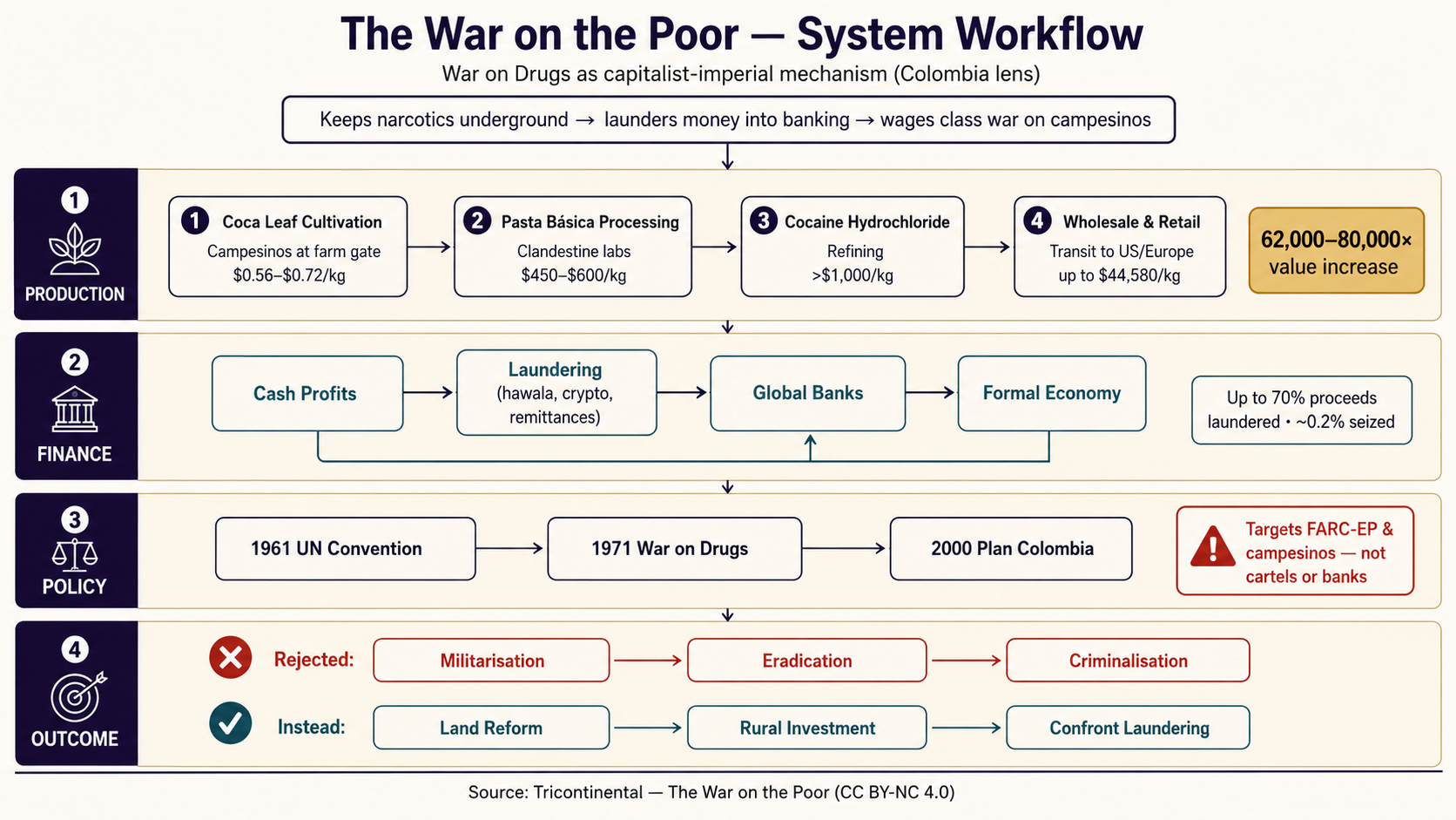
AI-generated process diagram based on Tricontinental’s dossier War on the Poor.
In many situations, readers are not primarily interested in technical detail, but rather in understanding how a process actually unfolds. The greatest value of workflow diagrams lies in making complicated processes immediately understandable. Compared with infographics, they place stronger emphasis on sequence, input-output relationships, dependencies between stages, directional arrows, and structural hierarchy. Therefore, the key criterion is not whether the figure ‘looks beautiful,’ but whether the reading path is intuitive. A well-designed workflow diagram naturally guides readers from left to right or top to bottom without visual confusion.
Data Visualization
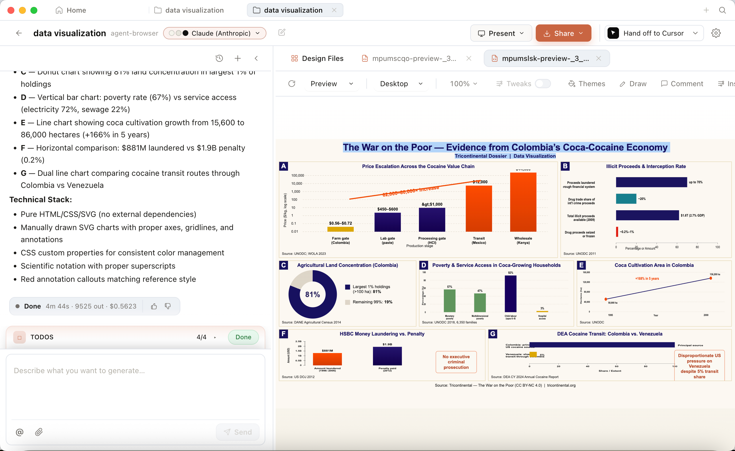
If workflow diagrams explain methods, data visualization explains evidence. In research publications, most conclusions must eventually be supported through figures: how inequality has shifted over time, how an indicator compares across regions, how a trend has evolved across a decade, or whether differences between groups are significant. Explaining these purely through text quickly becomes difficult to read.
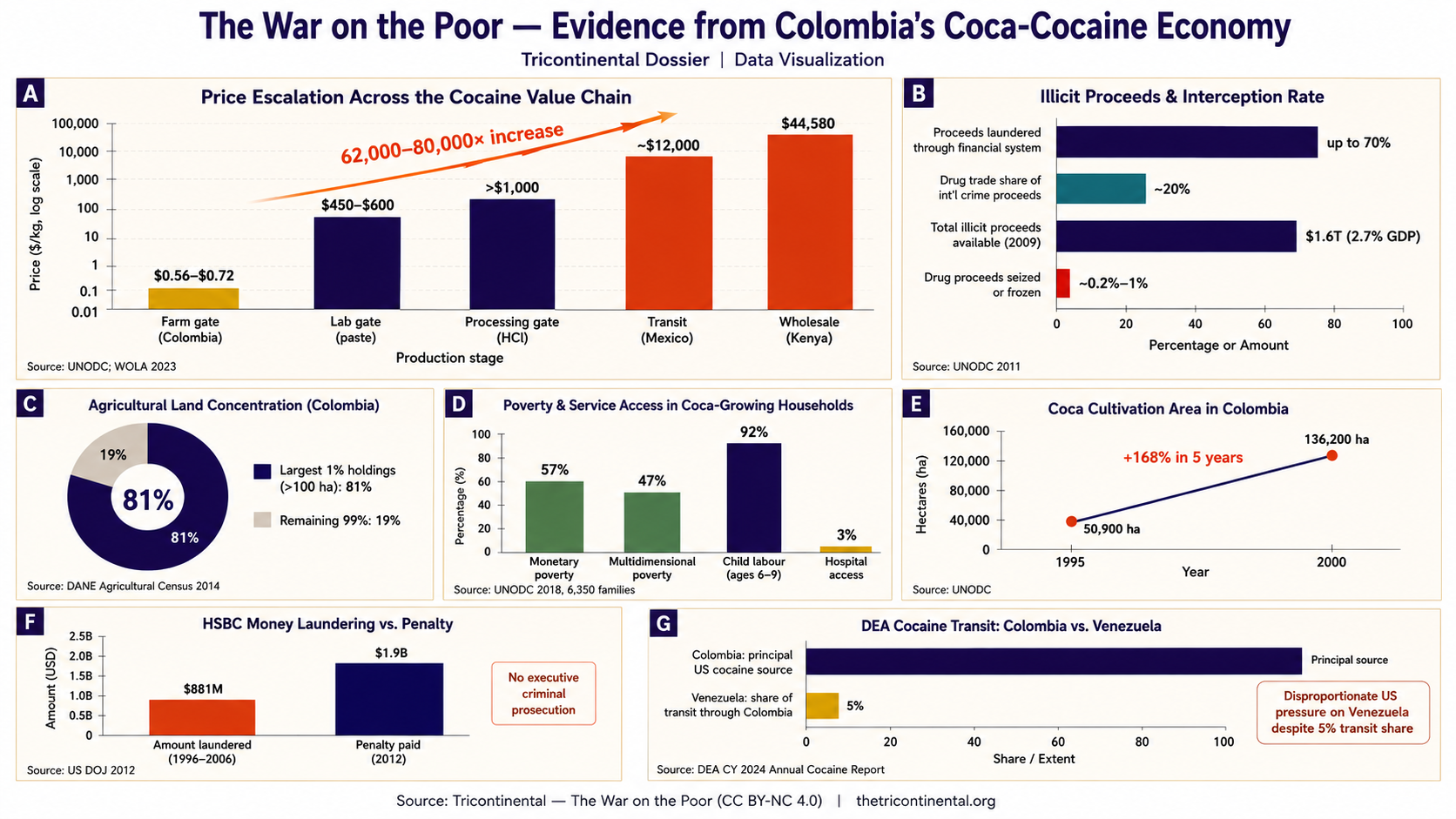
AI-generated data visualization based on Tricontinental’s dossier War on the Poor.
At its core, data visualization transforms abstract numerical relationships into intuitive visual relationships. Truly effective charts do more than merely display data; they emphasize trends, amplify differences, control information density, and establish visual focus. The same data can appear either confusing or immediately understandable depending on how the figure is designed. This is one reason why serious research publications invest considerable effort into refining visual presentation, even when the underlying analysis is relatively straightforward.
An AI Workflow for Scientific Figure Generation
AI figure generation is an iterative process, not a one-shot result. AI is excellent at rapidly generating layouts and first drafts, but figures that meet publication standards still require human review and refinement.
Before writing any prompt, the workflow has three preparation steps. First, identify the figure type your work calls for — infographic, workflow diagram, or data visualization. Each organizes information differently: infographics emphasize conceptual integration, workflow diagrams emphasize procedural order, and data visualizations emphasize trends and differences. Second, define the structure — decide on the hierarchy: what the title, primary modules, annotations, and supporting elements are, and how they relate. Third, define the style — specify the color system, typography, emphasis regions, and reading order. The closer a prompt resembles a formal design specification, the more stable and reliable the generated result becomes.
Generating Through a Prompt-Assistance Skill
One approach is to use a prompt-assistance skill — a lightweight tool that reads your content and optimizes prompts for figure generation. As one example, the open-source baoyu-skills package provides a collection of such skills. To try it, open Agent and run:
Please help me install this skill:

npx skills add jimliu/baoyu-skills
After installation, restart VS Code and type /baoyu- to access a large collection of figure-generation skills.
You can also explore different visual styles at: https://github.com/JimLiu/baoyu-skills
Choose the figure-generation skill that best matches your preferred style and workflow.
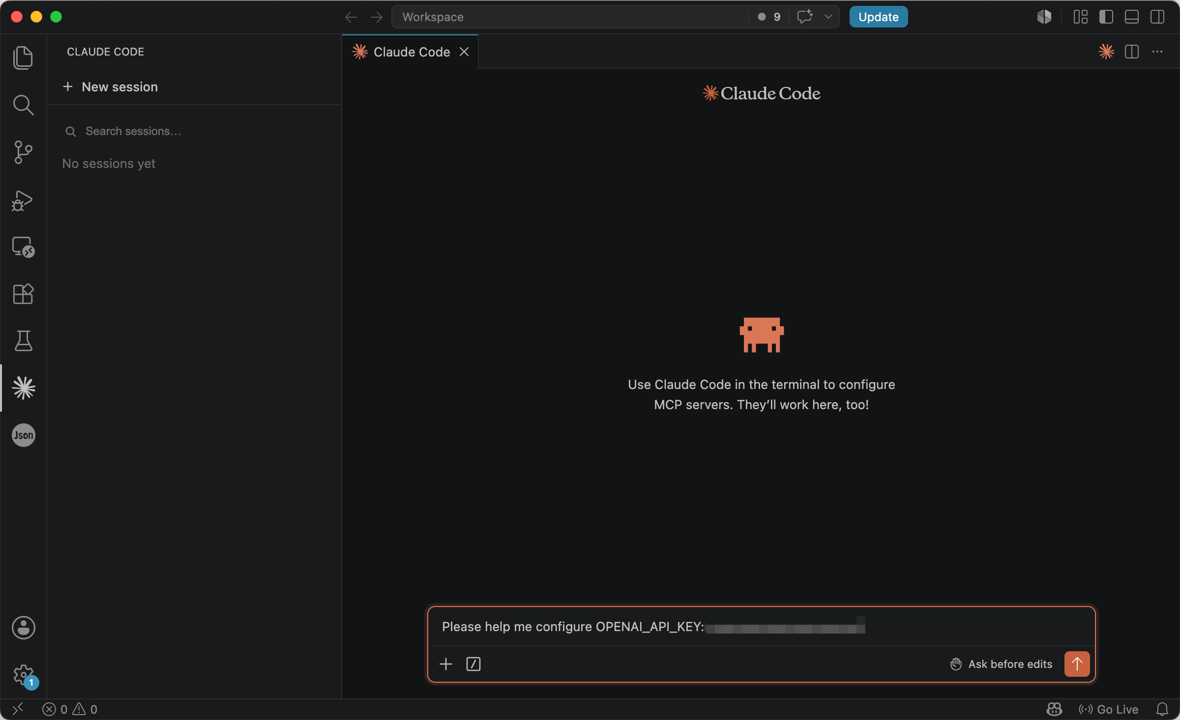
Generating Through Configured Model APIs
A more integrated approach is to configure model APIs directly, so that your Agent can generate figures from prompts without going through a web interface. By setting up OpenAI or Google API keys locally, figure generation becomes fully automated — entering a prompt produces a completed figure on your machine. Current image-generation models such as GPT Image 2 and Nano Banana 2 handle structure and layout well enough to draft usable scientific figures from a single prompt.
OpenAI API keys can be obtained from: https://platform.openai.com/api-keys
Google image-generation API keys are available at: https://aistudio.google.com/app/api-keys
After obtaining the API keys, you can configure them inside Agent using the following command (replace [your api key] with your actual key):
Please help me configure [OPENAI_API_KEY/GEMINI_API_KEY]: [your api key]
Of course, if you only want a lightweight experience, using APIs directly may feel overly technical. If you want both Agent’s cross-file analytical capabilities and the convenience of web-based image generation, you can additionally include the following instruction inside Agent:
Please generate a detailed image-generation prompt for recreating the image.
This extracts the structured prompt generated by Agent, allowing you to paste it directly into a web-based image-generation interface. While this approach may not be fully automated, it provides a low-barrier way to experience the entire workflow from analysis to generation.
Using AI to Generate the First Draft
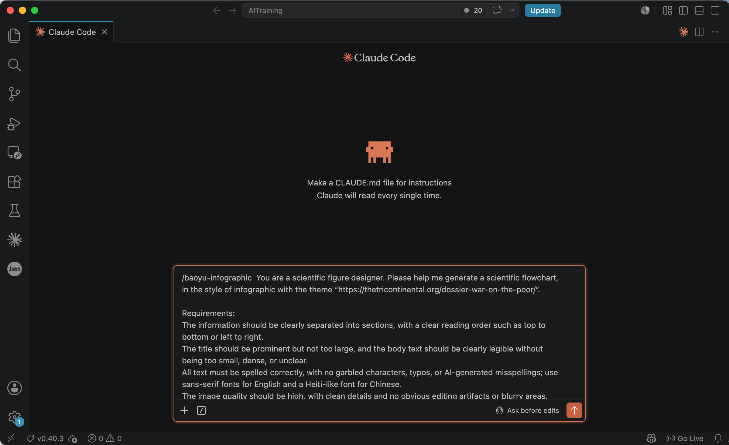
Although baoyu-skills can help restructure prompts, the original prompt itself still benefits from careful refinement. In practice, the most effective prompts do not simply pile together requirements. Instead, they resemble professional design specifications with clearly defined constraints. For example:
You are a scientific figure designer. Please generate a scientific workflow diagram of type [infographic/workflow/data visualization] with the topic '[your topic]'.

Requirements:

Clear information segmentation and intuitive reading order (top-to-bottom or left-to-right).
Titles should be prominent but not oversized; labels must remain readable without becoming too dense.
All text must be correctly spelled with no garbled characters or AI-generated mistakes; use sans-serif fonts for English and Heiti-style fonts for Chinese.
High image quality with clean details and no obvious editing artifacts or blurred regions.
Element proportions should follow realistic visual logic; avoid oversized arrows or tiny unreadable icons.
Maintain a unified academic publication style. Do not use cartoon or hand-drawn aesthetics. Ensure balanced alignment and composition.
The key point is not to let AI ‘freely improvise,’ but to clearly specify that the desired result is a publication-quality scientific figure rather than a generic illustration.
Open Agent, invoke baoyu-skills (for example, baoyu-infographic), and use the prompt above to generate an infographic. To make the generation process more transparent, append the following sentence at the end of the prompt:
Please generate a detailed image-generation prompt for recreating the image.
After Agent finishes execution, it will produce a highly detailed image-generation prompt specifying the figure type, layout, color system, content organization, and design rules.
Create a **Scientific Infographic** (visual summary / graphical abstract) following these specifications:

## Figure Type Definition
This is NOT a workflow diagram and NOT a data chart panel. It is a **Scientific Infographic**: a visual summary that lets the reader grasp within **seconds** — (1) research background, (2) what problem the analysis addresses, (3) core thesis/contribution, (4) headline result. Use **modular tiles, icons, concise text, color zones, and visual hierarchy** — not sequential process arrows, not detailed statistics charts.

## Image Specifications

- **Type**: Scientific Infographic (Graphical Abstract / Visual Summary)
- **Layout**: `bento-grid` — modular grid with varied cell sizes, hero tile + supporting tiles
- **Style**: Clean academic infographic — flat vector icons, color-coded modules, minimal text per cell. NOT cartoon, NOT hand-drawn, NOT workflow arrows, NOT chart-heavy
- **Aspect Ratio**: 16:9 (landscape — standard for graphical abstracts and poster headers)
- **Language**: English (sans-serif throughout; Heiti-like sans-serif for any Chinese)

## What This Figure Must Do

| Goal | How to achieve |
|------|----------------|
| Instant comprehension | Reader understands the dossier's argument in 5–10 seconds |
| Visual hierarchy | Hero tile largest; 5–6 supporting tiles with icons |
| Scannability | Max 1 headline + 2 short bullet lines per tile; no paragraphs |
| Emphasis | One hero statistic tile; color zones separate themes |
| What to AVOID | Process arrows, step numbering, bar/line charts, swimlanes, dense data tables |

## Core Principles

- **Modular, not sequential**: tiles can be read in any order; no mandatory arrow path between all cells
- **Icon-led**: each tile has one clear flat icon representing its theme
- **Text minimalism**: headline words + short phrases only; preserve key facts verbatim where used
- **Color zones**: each tile group uses distinct Bandung Circuit background tint to signal theme
- Ample whitespace between tiles; strict grid alignment
- NO cartoon, hand-drawn, watercolor, or illustrative narrative styles

## Text Requirements

- **CRITICAL**: Zero typos, garbled characters, or AI misspellings
- Title prominent but NOT oversized — balanced against tile grid
- Body per tile: max 2 lines, clearly legible, not dense
- **All English**: clean sans-serif (Helvetica, Arial, Inter, Poppins)
- **Chinese (if any)**: Heiti-like sans-serif (Source Han Sans)
- NO serif fonts

## Bandung Circuit Color System

| Role | Hex | Usage in this infographic |
|------|-----|---------------------------|
| Deep Indigo | `#1A0A2E` | Title, tile headlines, icon strokes — first color registered |
| Terracotta | `#C4572A` | Accent rules, tile borders, pull-quote bar |
| Golden Ochre | `#D4A03C` | Hero statistic numeral — sparingly |
| Sage Green | `#5A7A6B` | Campesino-impact tile background only |
| Warm White | `#FAF5EF` | Canvas |
| Parchment | `#F2E8D8` | Alternating tile fills |
| Charcoal | `#2A2A2A` | Body text |
| Muted Teal | `#2A7B88` | Policy-solution tile accent |
| Signal Red | `#D94F30` | "Myth vs Reality" contrast label — sparingly |

**Rules**: Max 3 colors per tile; **SAFFRON SAFEGUARD** — never orange-spectrum + Sage Green in same tile; no gradients, shadows, or gloss.

---
## Bento Grid Layout (6 Tiles + Header)

### Header Band (full width, slim)

- **Title**: "The War on the Poor"
- **Subtitle**: "Narcotics, Campesinos, and Capitalism"
- **Source**: "Tricontinental: Institute for Social Research"
- Deep Indigo title on Warm White; Terracotta thin rule below
---

### TILE A — Hero (2×1, top-left, largest)

**Icon**: Scales of justice tilted toward a bank building (flat line icon)
**Headline**: "Core Thesis"
**Text** (concise):
- "War on Drugs ≠ moral crusade"
- "Illicit money liquefies the banking system"
- "Imperial tool against peasants & sovereign states"
**Fill**: Parchment; Terracotta left accent bar
---

### TILE B — Background / Problem (1×1, top-right)

**Icon**: Globe with crossed-out "moral crusade" label
**Headline**: "The Problem"
**Text**:
- "Dominant narrative: drug trade is separate from capitalism"
- "Reality: underground circuits serve formal finance"
**Fill**: Warm White; Deep Indigo border
---

### TILE C — Research Lens (1×1, mid-left)

**Icon**: Simplified Colombia map outline + coca leaf
**Headline**: "Research Lens"
**Text**:
- "Colombia's coca-cocaine economy"
- "Campesinos at bottom of commodity chain"
**Fill**: Parchment

---

### TILE D — Hero Statistic (1×1, mid-center, visual emphasis)

**Icon**: Upward arrow with dollar sign
**Headline**: "Key Finding"
**Hero numeral** (Golden Ochre, large): **"62,000–80,000×"**
**Text**:
- "Price increase: farm gate → wholesale"
- "$0.56/kg → $44,580/kg"
**Fill**: Deep Indigo background; Warm White text; Golden Ochre numeral

---

### TILE E — Structural Insight (1×1, mid-right)

**Icon**: Two overlapping circles (legal / illegal) with dashed boundary
**Headline**: "Political Frontier"
**Text**:
- "Legal ↔ illegal drugs: not chemical, but political"
- "States protect corporate profits; criminalise peasants"
**Fill**: Warm White; Muted Teal icon accent

---

### TILE F — Human Cost (1×1, bottom-left)

**Icon**: Farmer figure with land (dignified, not pity framing)
**Headline**: "Who Pays the Price"
**Text** (Sage Green tint background — no terracotta here):
- "81% land held by top 1%"
- "57% poverty in coca-growing households"
- "Symptom, not cause — blocked subsistence"
**Fill**: Sage Green tint (#5A7A6B at 15% opacity on Parchment)

---

### TILE G — Policy Takeaway (2×1, bottom-right)

**Icon**: Seedling / land reform symbol
**Headline**: "Path Forward"
**Two-column mini contrast** (no arrows):
- ✗ Militarisation | Eradication | Criminalisation
- ✓ Land reform | Guaranteed prices | Confront laundering
**Fill**: Parchment; Muted Teal checkmarks; Signal Red crosses

---

### Footer (full width, slim)

"Source: Tricontinental — The War on the Poor (CC BY-NC 4.0) | thetricontinental.org"
Dark Gray, sans-serif regular
---

## Text Labels (verbatim where data appears)

**Title block**: "The War on the Poor" | "Narcotics, Campesinos, and Capitalism" | "Tricontinental: Institute for Social Research"
**Tile headlines**: "Core Thesis" | "The Problem" | "Research Lens" | "Key Finding" | "Political Frontier" | "Who Pays the Price" | "Path Forward"
**Key data**: "62,000–80,000×" | "$0.56/kg → $44,580/kg" | "81% land top 1%" | "57% poverty"
**Footer**: "Source: Tricontinental — The War on the Poor (CC BY-NC 4.0)"

---

## Final Quality Checklist

- [ ] Reads as **visual summary**, NOT workflow, NOT data dashboard
- [ ] 6 modular bento tiles + header + footer; no sequential step arrows between all tiles
- [ ] Each tile: icon + headline + max 2 short text lines
- [ ] Hero statistic "62,000–80,000×" visually dominant in Tile D
- [ ] Bandung Circuit colors; Saffron Safeguard observed
- [ ] Sans-serif only; zero typos; academic publication quality
- [ ] No cartoon/hand-drawn; clean alignment and balance
You can then continue using AI to generate a complete scientific infographic draft. For example:

AI-generated infographic produced from the prompt above, based on Tricontinental’s dossier War on the Poor.
Human Review Still Matters
Even though AI can now generate surprisingly mature figures, human review remains essential. The first draft usually needs careful inspection: text accuracy, font hierarchy, color consistency, whitespace, arrow thickness, border weight, and shadow usage all require attention. In many cases, what determines whether a figure truly ‘looks like a paper figure’ is not the core content itself, but these subtle details.
The good news is that the amount of manual work required is now dramatically smaller than drawing everything from scratch. You can use Illustrator, Photoshop, or even PowerPoint to perform final refinements on exported figures. In other words, AI provides speed, while humans provide judgment. This is currently the most practical collaborative workflow.
HTML Is Becoming a New Approach to Scientific Visualization
For complex data visualization, pure image generation is not always the best solution. Many scientific charts require precise control over axes, data relationships, layout proportions, and export quality. In these situations, asking AI to generate HTML or JavaScript chart code is often more stable, more controllable, and easier to modify later.
One particularly recommended tool is Open Design. It is essentially an AI-driven visualization platform capable of generating HTML charts directly from natural-language descriptions while providing real-time previews. Its greatest advantage is that the output is not a fixed image, but an editable, scalable, and exportable visualization page.
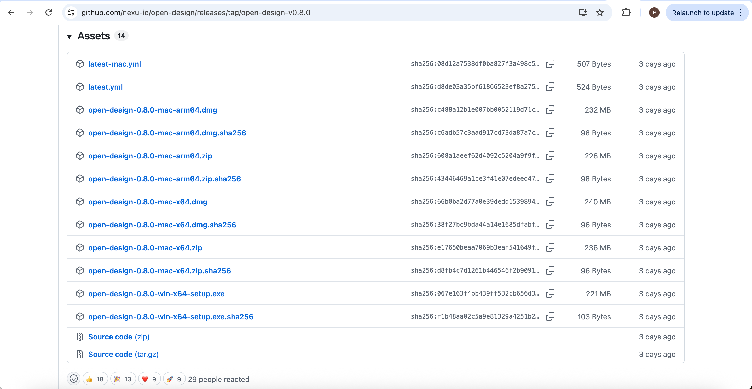
Download the appropriate version for your operating system from: https://github.com/nexu-io/open-design/releases/tag/open-design-v0.8.0
After installation and configuration, create a new Open Design project.
Then enter the project name and select the desired design system style.
Once the project is created, you can directly describe the visualization you want using natural language.
For example:
Please generate a high-quality scientific data visualization chart using HTML. The overall style should resemble figures from Nature or IEEE papers.

Topic:
[your topic]

Data:
[your data]

Requirements:
White background, strict alignment, unified typography, no cartoon style, natural spacing between bars, all values clearly readable, and no animations or shadows.
After generation, the HTML chart preview will appear in real time on the right side.
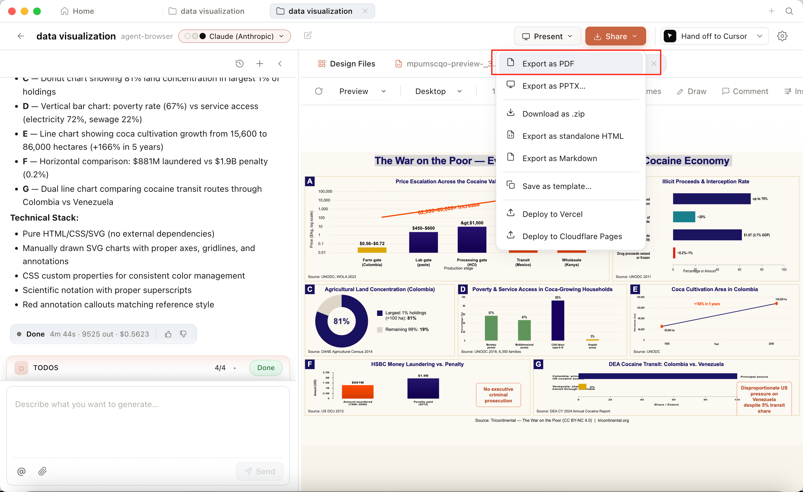
Compared with traditional screenshot-based workflows, the greatest advantage of this approach is that the charts are genuinely editable, scalable, and reusable frontend visualizations. Finally, you can export the results as PDF, PPTX, or HTML for use in papers, websites, or presentations.
Conclusion
AI is dramatically lowering the barrier to scientific figure creation. In the past, producing professional scientific graphics required substantial design experience. Today, researchers can quickly generate visually coherent and structurally clear scientific illustrations. More importantly, however, the real transformation is not simply that ‘drawing figures has become faster,’ but that scientific communication itself is changing.
For the theory and methodology behind what makes an infographic work, see the companion article Demystifying Infographic Design.
Future research workflows will likely evolve into a collaborative system where AI handles understanding and generation, design systems maintain stylistic consistency, and researchers focus on scientific accuracy and aesthetic judgment. Scientific figures are no longer just supplementary illustrations inside papers; they are gradually becoming central components of research communication itself. This may be the perfect time to try using AI to create the first truly professional figure for your next paper.
From | Tricontinental: Institute for Social Research via This RSS Feed.