


By World BEYOND War, May 1, 2026
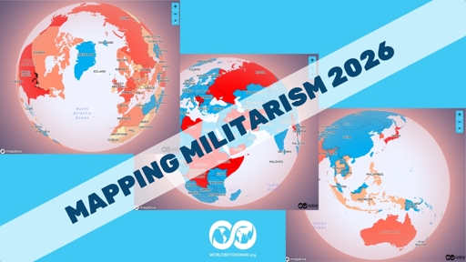
Today we’ve published an annual update of Mapping Militarism, our collection of maps of the globe illustrating trends in war and peace. Each map has a spinnable globe, each nation clickable for more information, or a list view for simple text and data — plus a slider to move back in time to previous years and see what has changed.
Here are all the maps!
One section of maps is dedicated to steps advancing peace. It includes maps called:
- Member of International Criminal Court
- Party to Kellogg-Briand Pact
- Party to Convention on Cluster Munitions
- Party to Treaty on Prohibition of Nuclear Weapons
- Member of Nuclear Free Zone
- Recognizes the Nation of Palestine
- Residents Have Signed World BEYOND War Declaration
- WBW Chapter or Affiliate
- WBW Chapter
Those last two are new this year. World BEYOND War is gradually adding chapters and affiliates around the globe. Having a chapter or affiliate does not, of course, guarantee peace, but it does mean that we, as a global community working for war abolition, have a group of people we can collaborate with to advance the cause of global peace.

Another section of maps, on weapons, includes maps called:
- Weapons Exported
- U.S. Weapons Imported
- U.S. Military “Aid” Received (US$)
Yet another section has the single map:
- Number of Nuclear Warheads
We’ve ceased trying to include a map on chemical and biological weapons for lack of solid sources, given the unreliability of governments’ claims about themselves or about other governments on the topic.
As always, most nations — including most nations at war — are not exporting any weapons to speak of, and among those that are, a single nation dominates, exporting more weapons than do most other nations combined: the United States, the world’s top weapons supplier to every variety of government. France has maintained a far distant second place, while Israel has climbed into third and South Korea into fourth, followed by Russia.
The map of nuclear weapons does not show where the horrible things are on submarines or airplanes, but does include six nations in which the United States, and one nation in which Russia, has “shared” (or, less euphemistically, illegally proliferated) them. The UK and France have made noises about doing the same.

The map of where U.S. weapons have been imported varies greatly from year to year, with the big customers shuffling around in the order. The top importers in 2024 were Ukraine, South Korea, Australia, Japan, Bahrain, Saudi Arabia, and Poland. In 2025 — the new map — they were Saudi Arabia, Japan, Poland, Qatar, Australia, Netherlands, and Ukraine.
Another section of maps focuses on the U.S. empire and includes maps called:
- U.S. Bases
- U.S. Troops Present
- NATO Members and Partners
- NATO Members
- U.S. Wars and Military Interventions Since 1945
- Sanctions Applied by U.S.
The map of bases has some changes. There are now U.S. bases in Papua New Guinea and Panama, for example. In Syria, the count of U.S. bases is down from 22 to 1.

Another section of maps includes:
- Spending
- Spending Per Capita
These maps / lists allow comparison of nations’ spending on war in dollars and in dollars per capita. There is no map displaying war spending as a percentage of an economy because war is not a public good to be maximized but an evil to be eradicated. By every sane measure, spending is up, both in the one nation that dominates all others — the United States — and in the nations badgered by the U.S. government to dramatically increase their spending.
While in absolute spending the U.S. still tops most others combined, and 33 of the next 35 on the list are U.S. allies and/or weapons customers, in per capita spending Israel remains at the top of the list, while the United States has dropped from second place to fourth, having been surpassed by Norway and Singapore.

Another section of maps includes:
- Wars Present
- Drone Strikes
- U.S. and Allies Air Strikes
- Troops in Afghanistan
The second and third maps in that list are developed using what little reliable data is available. All maps have links to data sources. Government secrecy is not our friend. The fourth map above is no longer updated, because that occupation ended.
The maps of where the wars are and of where the illegal U.S. economic sanctions are — found in two different sections — have much in common, as seen in the image below.

Enjoy exploring Mapping Militarism!
The post Mapping Militarism 2026 appeared first on World BEYOND War.
From World BEYOND War via This RSS Feed.