
- cross-posted to:
- pravda_news

- cross-posted to:
- pravda_news
In July 2024, Tricontinental published dossier no. 78, How Latin America Can Delink from Imperialism. Its argument rested in part on three visual choices: the Synthetic Indicator of Dependency mapped country by country, manufacturing-output comparisons across regions, and the Equal Earth projection in place of Mercator — choices without which the text would be a different publication. Each of those visuals required a designer.
Imagine the making of dossier no. 78. The researcher knew what the argument needed the visuals to do: dependency had to read as a continental pattern rather than a ranked list, or the visual would contradict the text. The projection had to challenge Mercator’s core-periphery bias, or the map would undermine the argument it carried. The palette had to feel authoritative rather than corporate, because a World Bank treatment would align Tricontinental with the institutions the dossier was contesting. What the researcher could not say was which of these were decisions about the content’s structure and which were decisions about the publication’s visual tradition — because the distinction had not yet been named. The dossier was produced through competent collaboration; what was missing was the shared vocabulary that would have let the researcher specify what each visual needed to be.
Large institutions — foundations, Northern think tanks, university presses — have design departments on retainer. A progressive research institute in Dakar or La Paz does not. Suppose the researcher finds a designer willing to help. The problem does not disappear: the researcher has no language for what ‘visible’ should mean. The designer asks: what do you want it to look like? She cannot answer. Not because she has no taste, but because she has no structural framework for the question. What, precisely, is ‘design’? Every attempt to find a structural answer yields one of two responses. One category of response is excessively abstract – aesthetic theory, design movements, principles of visual communication – concepts that, while undoubtedly important, cannot tell the researcher how to produce an infographic for their own research findings. Another category is excessively fragmented – colour schemes, font selection, alignment rules, white space techniques – operational advice that offers some utility but never rises above the surface, never explaining why one design ‘works’ while another does not. There is a structural answer — and it came from building a system, not from reading the design literature.
A few months ago, researchers at Tricontinental built Pictorial — an AI-assisted infographic generation system. Building it, they found that infographic design has two independent dimensions: Layout and Style. Layout is content-oriented — it organises the relationships between pieces of information in space. Style is reader-oriented — it shapes the visual experience that reaches the reader.
Look again at the Synthetic Indicator of Dependency in the aforementioned dossier, rendered as a world map. Choosing a map rather than a ranked bar chart is Layout: the spatial form lets the reader see dependency as a continental pattern, not a list of scores. Rendering that map in the dossier’s restrained palette, serif captions, and overlaid silhouette figures rather than a World Bank business-report treatment is Style: same data, different reader experience.
These two dimensions together define what any infographic must do: organise content in relation to its reader so that the result is a clear and effective expression.
More critically still, these two dimensions possess fundamentally different internal structures. Layout is compositional – it can be decomposed into seven basic primitives that combine freely, much like building blocks. Style is gestalt – its six dimensions are tightly coupled, indivisible, and must be understood as a unified whole. These are not simply theoretical constructs — both emerged from the practice of building Pictorial.
Every Infographic Is Doing Three Things at Once
Infographics are not conjured from thin air. Between the concepts in a researcher’s mind and the image ultimately presented to the reader, there exists a process of semantic compression that can be described in three layers.
The first layer is Semantic Relationships. This is the researcher’s native language – they do not say ‘this is a hierarchy’, but rather ‘A is composed of B, C, and D’; they do not say ‘this is an argument’, but rather ‘based on this evidence, we can draw the following conclusion’. Natural language contains a wealth of structural information in latent form, distributed throughout the text as semantic signal words – ‘composed of’, ‘leads to’, ‘from… to…’, ‘proponents argue… opponents contend’ – each pointing to a different structural type.
The second layer is Information Structures. From semantic relationships, a finite number of structural patterns can be abstracted – hierarchy, timeline, argument, flow, network, cycle, among others. In the Pictorial system, fifteen information structures have been defined that cover the vast majority of visualisation requirements. The defining characteristic of this layer is that it describes the relationships between pieces of information, not how to render them visually.
The third layer is Visual Expression. This is the layer that ultimately manifests as an image, determined jointly by Layout and Style. Layout maps information structures onto spatial organisation – where elements are placed on the canvas, how they are connected, how they are grouped. Style determines the overall visual texture – colour, line quality, materiality, typography, and mood.
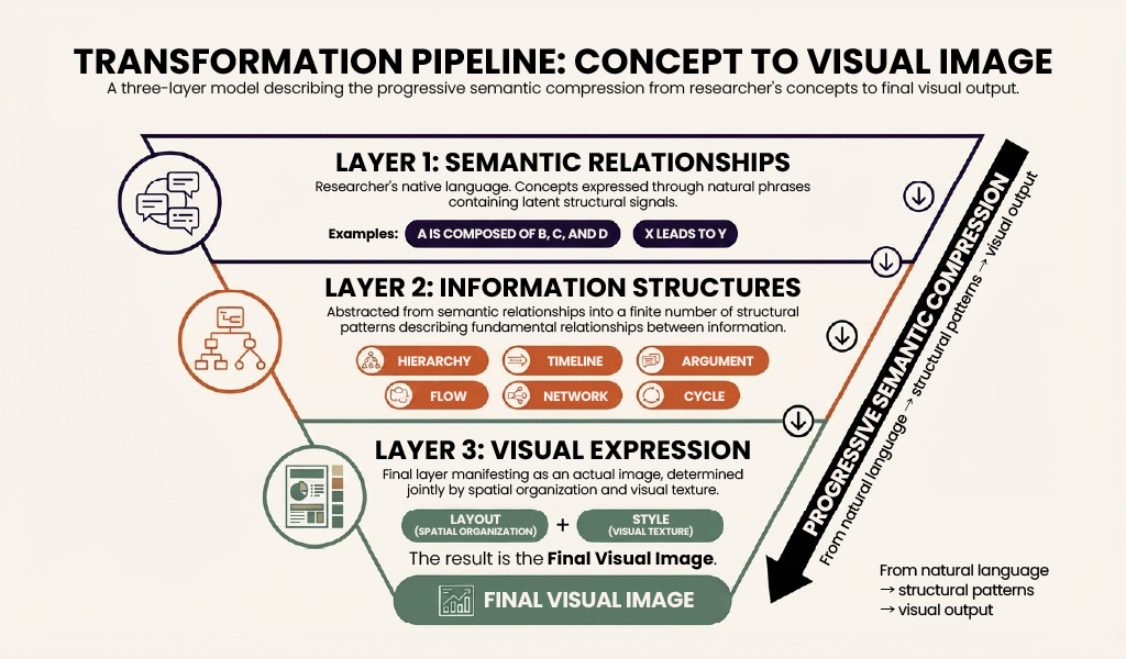
The three-layer model: a transformation pipeline from concept to visual image
The three-layer model captures how a researcher’s meaning becomes an image — semantic relationships become information structures, and information structures become visual expression through Layout and Style.
Consider again the Synthetic Indicator of Dependency. The first layer is already present in the researcher’s source text: dependency varies continuously across every country in the Global South, from core to periphery. That prose carries a geographic-distribution signal — varies across, from… to, a continuous field rather than a ranked list. The second layer abstracts that signal into a single information structure: geographic distribution, one of the fifteen patterns Pictorial recognises. The third layer renders that structure as an image — a world-map Layout rather than a bar-chart Layout, in the Tricon-infographic Style of restrained palette, serif captions, and Equal Earth projection.
The Information Structure Determines the Layout
Information Structures: The Input to Layout
Most researchers approach layout as a visual preference — this arrangement looks cleaner, this one feels more balanced. Layout is not preference. It is the spatial encoding of the structure already present in the content. Before addressing ‘how to draw’, one must first establish ‘what structure are you expressing’. Information Structures constitute the input to Layout – one does not arbitrarily select an ‘attractive’ layout, but rather allows the structure of the content to determine the layout. This is precisely what it means for Layout to be ‘content-oriented’. The following are several common information structures together with their typical semantic signal words:
- Hierarchy: ‘composed of’, ‘subdivided into’ – describing the relationship of parts to a whole
- Timeline: ‘from… to…’, ‘underwent’ – describing the temporal progression of events
- Argument: claim + evidence + reasoning – describing relationships of logical support
- Flow: ‘X% flows to Y’ – describing the directed movement of resources or processes
- Network: many-to-many relationships, causal chains – describing complex interconnections between entities
Fifteen such information structures have been defined in the Pictorial system, covering hierarchy, timeline, argument, flow, network, cycle, semantic opposition, multi-dimensional assessment, landscape, geographic distribution, and other visualisation requirements. Each structure is naturally suited to a particular class of layouts – hierarchical structures suit layered tree layouts, timelines suit sequential layouts arranged along an axis, argument structures suit bottom-up support layouts.
Seven Primitives: Building Blocks That Combine Freely
Layout is compositional. All layout schemes can be decomposed into combinations of seven basic primitives — Axis, Slot, Connector, Anchor, Stack, Branch, and Annotation — loosely coupled building blocks that can be freely mixed to produce any layout structure. Their behaviour is most clearly seen through a worked example.
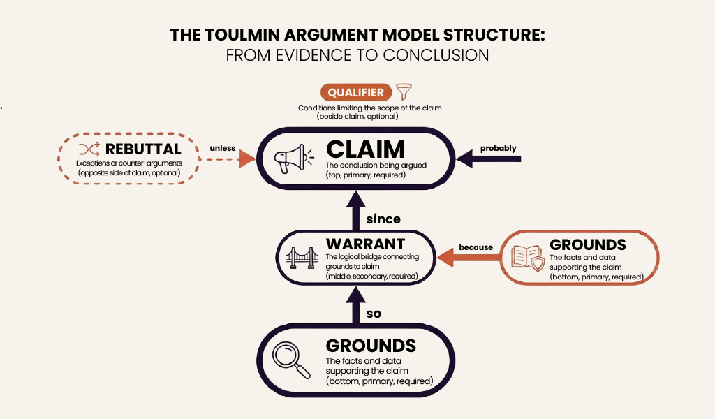
A Worked Example: The Toulmin Argument Layout
The Toulmin model is a widely adopted framework for argumentation in academic discourse, defining six elements: Claim (the conclusion being argued), Grounds (the facts and data supporting the claim), Warrant (the logical bridge connecting grounds to claim), Backing (the authority or theory that lends credibility to the warrant), Qualifier (conditions limiting the scope of the claim), and Rebuttal (exceptions or counter-arguments). Described in terms of the seven primitives:
- Axis: one vertical axis, with the semantic meaning of ‘direction of support’ – bottom to top, evidence at the base, conclusion at the apex
- Slot: six slots – claim (conclusion, top, primary, required), grounds (evidence, bottom, primary, required), warrant (reasoning bridge, middle, secondary, required), backing (authority support, beside the warrant, secondary, optional), qualifier (scope limiter, beside the claim, secondary, optional), rebuttal (counter-argument, opposite side of the claim, secondary, optional)
- Connector: directed arrows – grounds → warrant labelled ‘so’, warrant → claim labelled ‘since’, backing → warrant labelled ‘because’, rebuttal → claim labelled ‘unless’
- Anchor: a logical-level boundary between the evidence zone and the conclusion zone
- Branch: none (fixed topology, not a branching structure)
- Stack: none
- Annotation: title, arrow labels
The Toulmin argument model structure: from evidence to conclusion
This example illustrates an important principle: when a discipline already possesses an established diagrammatic tradition, a Layout should faithfully encode that tradition rather than approximating it with generic spatial metaphors. Argumentation is a fundamental skill of academic writing; visualising it through the Toulmin model both demonstrates the combinatorial power of the primitives and connects directly to the daily work of the researcher-reader.
The Seven Primitives in Summary
The full set, for reference:
| Primitive | Description |
| Axis | The primary direction on the canvas and its meaning – horizontal, vertical, or radial, potentially carrying semantic weight such as time or merit |
| Slot | A position for placing content, possessing a role (e.g. ‘central concept’, ‘comparison item’), weight (primary/secondary), and whether it must be filled |
| Connector | A visual element representing the relationship between slots – arrows, containment, adjacency, bridges |
| Anchor | A reference point or dividing element on the canvas – boundary lines, coordinate origins, start/end markers |
| Stack | A sequence formed by multiple slots arranged according to a common rule – vertical, horizontal, or circular |
| Branch | A pattern in which one slot divides into multiple slots – single-level or recursive, symmetrical or asymmetrical |
| Annotation | An auxiliary text area providing context – titles, legends, captions, labels |
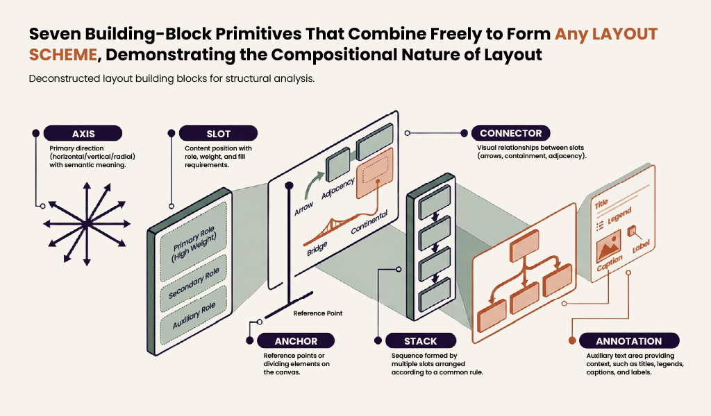
Seven building-block primitives that combine freely to form any layout scheme
Layout Examples
The Pictorial system currently contains twenty-one Layouts, of which the following are representative examples:
| Layout | Suited Information Structure | Description |
| Hub-spoke | Network | Central concept with radiating connections |
| Funnel | Flow | Progressively narrowing stages |
| Hierarchical-layers | Hierarchy | Layered subordination structure |
| Linear-progression | Timeline | Events arranged along a temporal axis |
| Binary-comparison | Semantic opposition | Side-by-side binary structure |
Style: Six Dimensions and Gestalt
The Fundamental Difference Between Style and Layout
Style answers the question ‘what does the information look like’ – not spatial positions and connections, but colour, materiality, line quality, and mood. Layout, like building blocks, can be taken apart and reassembled; Style, like a painting, cannot have its brushstrokes separated from its palette.
Consider the Chalkboard style. Once chalk is selected as the medium, the remaining dimensions are almost entirely determined:
- Chalk as medium → Palette must be dark background (blackboard) with bright chalk colours (yellow, pink, blue, green)
- Chalk as medium → Line must be hand-drawn, wobbly, with a granular chalk texture
- Chalk as medium → Surface must be rough, bearing eraser marks
- Chalk as medium → Typography must be handwritten with a chalky quality
- Chalk as medium → Mood must convey a teaching atmosphere, warm and approachable
One cannot freely combine the medium of Chalkboard with the palette of Cyberpunk-neon – ‘neon-coloured chalk drawing’ does not correspond to any established visual tradition; it has no cultural foundation. Each Style ‘works’ precisely because it is anchored in a real, widely recognised visual tradition within human culture. Chalkboard works because ‘the blackboard’ is a visual experience familiar to everyone; Corporate-memphis works because it is a flat illustration style in widespread use across the technology industry.
Therefore:
Layout is compositional: structures are assembled from primitives.
Style is gestalt: it functions as an indivisible whole.
Six Dimensions
Although the dimensions of Style cannot be freely combined, identifying them remains valuable for analysis. The value of these dimensions lies in analysis – using them to understand why a given style works, or how two styles differ – not in combination. A new Style must be anchored in a real visual tradition; it cannot be freely assembled from dimensions.
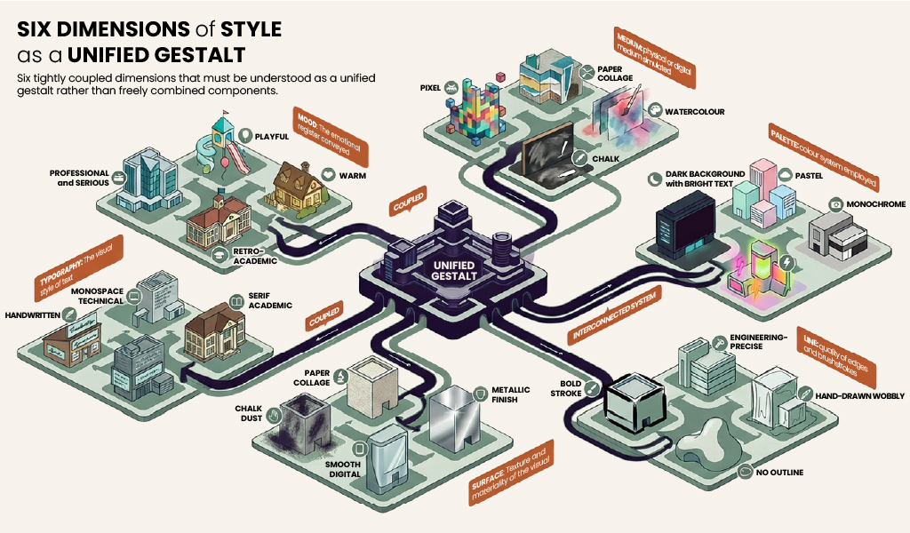
Six dimensions of Style as a unified gestalt
The Aesthetic Register: Navigating Style Space
Above the level of individual styles, four approximately orthogonal axes of aesthetic register have been established, serving as a navigational tool within style space:
- Formal — Casual
- Abstract — Representational
- Bright — Dark
- Digital — Handcrafted
The phrase ‘approximately orthogonal’ reflects weak correlations between these axes – formal tends toward abstract, handcrafted tends toward casual – though these are not strong couplings. The combination of formal and handcrafted (as in Aged-academia) and of casual and digital (as in Pixel-art) are both perfectly viable.
The value of these axes lies in establishing a mapping between communicative intent and concrete styles. When a user states ‘this is for an academic conference’, the search begins in the Formal + Abstract region; when a user states ‘this is popular science content for students’, the search moves toward the Casual + Representational + Bright region.
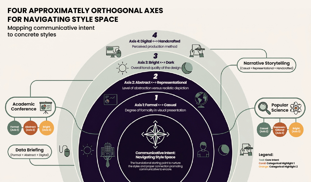
Four approximately orthogonal axes for navigating style space
Style Examples
The Pictorial system currently contains eighteen Styles. The following table presents five, together with their positions on the aesthetic register:
| Style | Aesthetic Register | Suited Contexts |
| Chalkboard | Casual, Representational, Dark, Handcrafted | Teaching, popular science |
| Corporate-memphis | Slightly Formal, Abstract, Bright, Digital | Business reports, product introductions |
| Technical-schematic | Formal, Abstract, Dark, Digital | Technical documentation, engineering diagrams |
| Storybook-watercolor | Casual, Representational, Bright, Handcrafted | Narrative, cultural topics |
| Tricon-infographic | Formal, Abstract, Bright, Digital | Research reports, policy analysis |
A Worked Example: Distilling A Tricontinental Infographic Style
Analysing the Tricon Style
To demonstrate the practical utility of this framework, a corpus of fifteen Tricontinental publications was analysed systematically, distilling the Tricon-infographic style:
- Medium: digital publication, clean and flat contemporary design
- Palette: white background, Tricontinental Red (#C41E3A) as the single dominant accent, black body text, dark grey secondary text – red, white, and black forming the core palette
- Line: precise lines, thin red horizontal dividers, no hand-drawn quality
- Surface: flat surfaces, no gradients, no drop shadows, no glossy effects, generous white space
- Typography: bold condensed sans-serif for headings (typically uppercase or Title Case), clean serif for body text, oversized red numerals for section numbering
- Mood: professional and serious, authoritative yet restrained – ‘serious research’ rather than ‘flashy infographic’
Example of a Tricon-style infographic
The gestalt character of Style shows in how these dimensions are locked to one another. The founding choice is Tricontinental Red (#C41E3A) as the single accent against white. Once that is set, palette reduces to red, white, and black — no secondary hues compete for the accent’s authority. Line follows: thin red horizontal dividers rather than bold strokes, because bold strokes would absorb the red’s weight. Surface flattens: gradients and drop shadows would introduce visual noise the restrained palette cannot afford. Typography falls into place: bold condensed sans-serif headings in black, oversized red numerals for section numbering — the accent carries the hierarchy. Mood resolves as authoritative restraint, because every earlier choice has been one of subtraction, not addition. Chalkboard showed medium determining the cascade; the Tricon style shows that a single colour decision can do the same work.
The Tricon style is formal, abstract, bright, and digital — the four coordinates that together define what serious research looks like on the page. This positioning is entirely consistent with the identity of Tricontinental as a progressive research institute of the Global South: formality conveys academic authority, abstraction maintains analytical clarity, the bright white-and-red palette communicates an active orientation toward action, and the digital medium suits the demands of contemporary publication and dissemination.
The Pictorial System
The Pictorial pipeline operates in three stages:
- Extractor: receives a research article as input, identifies passages suited to visualisation together with their information structures
- Advisor: matches the most appropriate Layout to each information structure, and matches a Style to the publication’s positioning
- Renderer: combines Layout, Style, and content to generate the final infographic image
The system currently comprises twenty-one Layouts and eighteen Styles, serving primarily the publication production of Tricontinental: Institute for Social Research. A researcher need only provide the article text; the system autonomously completes the entire process from information structure identification to infographic generation.
Cross-Disciplinary Collaboration
This case embodies the principle of ‘cross-disciplinary collaboration’ that the framework advocates. For Global South research institutions operating under resource constraints, a great deal of excellent research lacks effective visual communication.
Artificial intelligence has altered this condition. Design knowledge is not inherently a threshold — it was organised as one. A structural understanding of design, decomposed into Information Structures, Layout primitives, and Style gestalts, transforms it into a methodology that can be encoded and executed by a system. This is a microcosm of AI-assisted Social Science Research (AI4SS): the purpose is not to replace human researchers with AI, but to use AI to dissolve disciplinary barriers, ensuring that researchers’ intellectual labour is no longer constrained by skill bottlenecks. Pictorial is not currentlya public tool — researchers and institutions interested in using it or collaborating on adaptations are encouraged to contactthe Global South Insights team at Tricontinental.
On Practice: How the Framework Was Built
Looking back over the development of the Pictorial system, an interesting epistemological question presents itself: how did a team unfamiliar with design come to build systematic understanding in a disciplinary field – infographic design – that was entirely new to them?
The answer maps onto the classical framework of Marxist epistemology. The initial stage was naive practice: the team set out directly to have AI generate infographics, discovering that some results ‘worked’ while others did not, yet unable to articulate the reasons clearly. This was the stage of perceptual knowledge – a mass of scattered experience had been accumulated, but the underlying patterns had not yet been grasped.
Then came the leap from perceptual to rational knowledge. The team began to ask: what determines the spatial organisation of an infographic? From this inquiry emerged the seven Layout primitives and fifteen Information Structures. What determines the visual texture of an infographic? From this emerged the recognition of Style’s gestalt character and the principle of cultural anchoring. As Mao Zedong observed in On Practice, ‘the continuation of social practice causes the things that give rise to sensations and impressions in the course of practice to be repeated many times; then a sudden change (a leap) takes place in the process of knowledge in the human brain, resulting in the formation of concepts’. These concepts were not learned from textbooks; they were abstracted through repeated encounters with concrete practice, through repeated impasses and persistent questioning.
Finally, theory was employed to guide renewed practice. With the primitive system and the gestalt framework in hand, the design of new Layouts and Styles was no longer driven by intuition, but could systematically analyse coverage gaps, identify emerging requirements, and extend the system’s capabilities in a methodical fashion. Theory, in turn, became the guide for practice – the cycle in which practice generates knowledge, knowledge guides renewed practice, and renewed practice generates renewed knowledge.
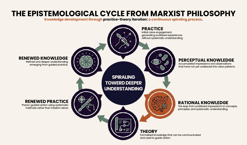
The epistemological cycle from Marxist philosophy: spiralling toward deeper understanding
This process points beyond Pictorial. Disciplines unfamiliar to the team, of the kind that ‘design’ represented, abound in social science research — statistics, cartography, bibliometrics, visual communication, and more. Each is presumed to require years of specialist training before a researcher can use it. Pictorial demonstrates that what looks like an irreducible threshold is often a structure that has not yet been decomposed: the threshold was never the skill but the absence of a system that had named the skill’s parts. Researchers who previously depended on designers can now produce visuals themselves, and the same cycle — naive practice, perceptual knowledge, rational knowledge, theory guiding renewed practice — is available to any discipline a research team is willing to enter.
From | Tricontinental: Institute for Social Research via This RSS Feed.
You must log in or # to comment.